Background
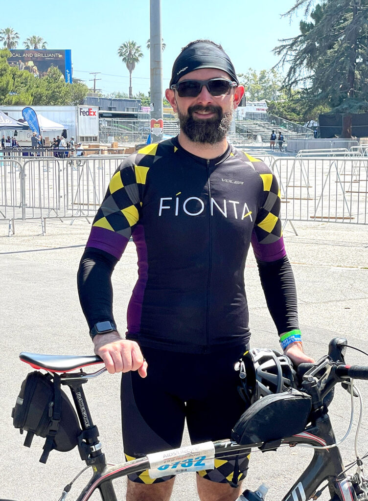
Senior technical architect, David Manuel, recently completed his fourth tour of the AIDS/LifeCycle ride, a 545-mile ride from San Francisco to Los Angeles. Each participant is required to fundraise a minimum of $3,500; in 2022, the organization and riders raised $17,783,163! Over seven days, the cyclists sweat it out together, celebrate their wins, support each other, and find themselves changed for life by this experience.
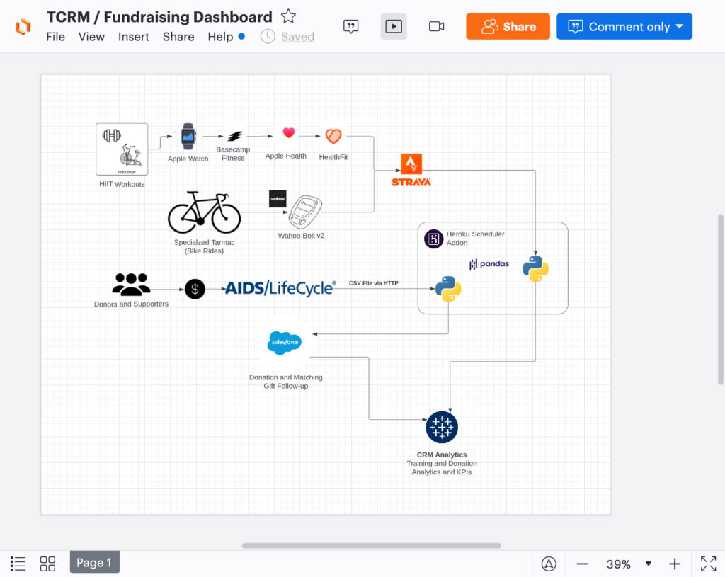
Training begins months in advance as even seasoned cyclists must prepare their bodies for the ride’s protracted distance and required daily mileage. From tracking miles and elevation to incoming donations, David was dealing with a lot of data. So, what’s a Salesforce Architect going to do about that? Analyze the datasets and sources, extract what’s needed, and display multiple sources in one visually pleasing CRM Analytics dashboard.
Acknowledging the problem
David realized early on that he faced a similar problem to years past, and frankly, to the position many of our nonprofit clients find themselves in – the data was messy. For example, some past donors provided a different email address than in years past. LYBUNT and SYBUNT reporting and consolidation were taking him hours to organize. Fíonta offers an employer match, but it’s not an automated process, so David ran the risk of not receiving the entire donation if an employee forgot to submit the match request.
Additionally, he tracked all training using Strava and Wahoo Bolt (a GPS mini-computer for his bike) and data from workouts at his local gym and at home; he had access to a wealth of data to inform his training plan.
Looking forward
David expects to complete the AIDS/LifeCycle ride again in the future, so he decided there was no time like the present to tackle these issues and create a sustainable system. His four major goals were to:
- Design a more exciting way to present the fundraising progress
- Track LYBUNT, SYBUNT and matching gift status without having to account for the duplicates in the source system every time
- Record his training progress week by week to ensure that he’d reach elevation and distance targets by the date of the ride without increasing training too quickly and causing injury
- Benchmark himself against prior years, especially after taking a long hiatus from biking during the COVID-19 pandemic
Gathering data and prepping for Salesforce integration
Ok, here’s where we get a little technical. Read on if that’s your thing or jump over to the final dashboard if you’re primarily into pretty charts.
David utilized Jupyter Notebooks to iteratively draft scripts to transform the data from Strava and the donation spreadsheet from the AIDS/LifeCycle portal and load it to Salesforce. Jupyter Notebooks allowed him to write and arrange code in a document/notebook-like format and to iteratively draft scripts using data-exploration libraries like Pandas.
Here’s how that process worked:
- The script reads the csv file directly from the donor portal, and
- Combines multiple address columns into one
- Maps spreadsheet columns to Salesforce field names, and
- Generates unique IDs for donations (email, gift date and amount) and donors (email)
- Sets required values (like Donation Stage, which is always closed/won in this case)
Using Pandas Dataframes to transform the data allowed David to preview the output and check his work before uploading it to Salesforce.
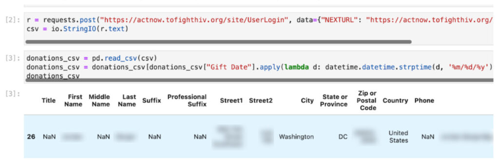
He worked first on the donors’ list, extracting needed data into a Python dictionary by email address containing the mapped Salesforce data and adjusting fields (like the combined mailing address field above.) Afterward, he created a list of the donations following a similar process and generated a “probably unique” ID (a combination of email, date, and amount that could conflict but probably won’t), and inserted Salesforce-specific fields like Stage. He compromised on the donation key because it could be repeatably generated from the source data even though it’s possible a donor could donate the same amount twice on the same day (but unlikely).
Loading data into Salesforce
Here’s where the rubber meets the road, if you’ll pardon the biking pun. What was the most efficient manner to import the donation and other data?
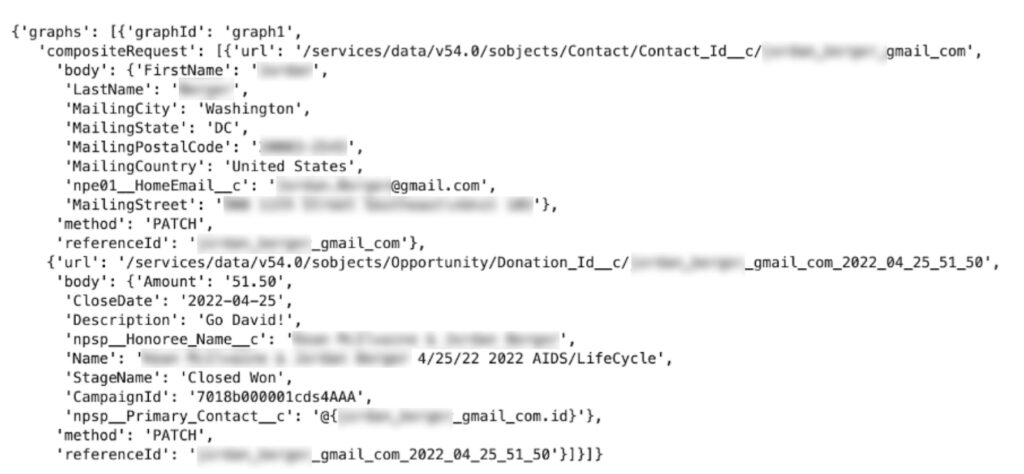
For small volumes of data like this, he would typically use the sObject REST API. However, in this case, that would require a separate request for each donor and donation and could result in inconsistent states if only one of the two succeeds. On the other hand, the Composite Graph API allowed David to insert or update multiple sets of contacts and gifts in one request and the “all or nothing” capability of the Composite Graph API made it simpler to handle failures as the sync can be corrected and retried. This proved extremely helpful as he tested this process. The Composite Graph API also has a relatively high limit (500 sub requests) per API call, so he would not have to batch the donations (at least not this year). While the Composite Graph API’s structure took more planning than creating the records one-by-one, David leveraged the Jupyter Notebooks to brainstorm and iterate and utilized the Simple Salesforce library to send the data to Salesforce as an HTTP POST request.
Preparing Nonprofit Success Pack (NPSP)
So David could take advantage of NPSP’s roll-ups in calculating this year and last ride’s donation totals for SYBUNT/LYBUNT reporting, he merged duplicate contacts to clean up the Salesforce side. He added estimated match fields and a list view to track coworkers who had donated personally but hadn’t yet taken advantage of Fíonta’s match, which required just a small additional effort.
Integrating training and workout data
Now, how about all that data gathered from David’s various exercise tracking apps? Miles biked and elevation gain were crucial so David could plan or adjust training. Also, it looks really cool to share how many miles he biked every week, let’s be honest.
In order to pull data out of Strava, he created an OAuth app within Strava and connected it to a new Notebook. There was some quick data refinement (adjusting his gym / HIIT workouts based on assumptions), and then he converted units and pushed the data to CRM Analytics.
Building the dashboard
Finally, the time came for all that juicy data to be displayed visually on a shareable dashboard. Donor data and Strava data first needed Data Prep Recipes in CRM Analytics (formerly Tableau CRM, formerly formerly Einstein Analytics, formerly formerly formerly Wave Analytics) to finalize the data for analysis. Using recipes, he could limit fields to only what needed to be published visually for donor data and pull in Campaign data with the fundraising cycle and ride details.
The Strava Recipe calculated training by week (miles and elevation) since October 1 and calculated an “ALC Year” that runs from July to June for year-over-year comparative analysis.
Syncing dashboard data
A dashboard is only helpful with up-to-date data. Overall fundraising totals are inspiring and can encourage visitors to contribute; training metrics are just downright inspiring (or depressing if you aren’t currently biking dozens of miles weekly).
David chose to push the code to Heroku (part of the Salesforce platform) and set the scheduler to sync once a day. As he was using the free tier and each sync consumes “dyno hours” (Heroku’s billable unit), daily was the best option. The Heroku Scheduler add-on supports running a script as frequently as every 10 minutes. Lastly, he added a Flask app to expose the dashboard via Salesforce’s Lightning Out. Lightning Out is a technology that enables someone to take Lightning components built on the Force.com platform and embed them in other platforms like Heroku (as well as Sharepoint, SAP, and others).
The result?
Talk about burying the lede. Here’s the final, official David Manuel AIDS/LifeCycle Fundraising and Training Dashboard, built on the Salesforce platform and supported by third-party apps. As of ride week, David raised $7,424.69. If you’re inspired by the mission or just plain wowed by the CRM Analytics dashboard, consider donating to AIDS/LifeCycle. Donations support San Francisco AIDS Foundation and the Los Angeles LGBT Center.